Can I just say how unbearable this crystal UI is, it’s just so frustrating to work with.
It’s all mixed up, just everything, the 5* comes first before the 4*, the titan comes first before the basic, the mythic crystal basically swapping positions with the relic crystals.
Though the main crystal tab is okay, please put the paragon and valiant crystals next to each luther please, it’s unorganised and everything feels lumped together.
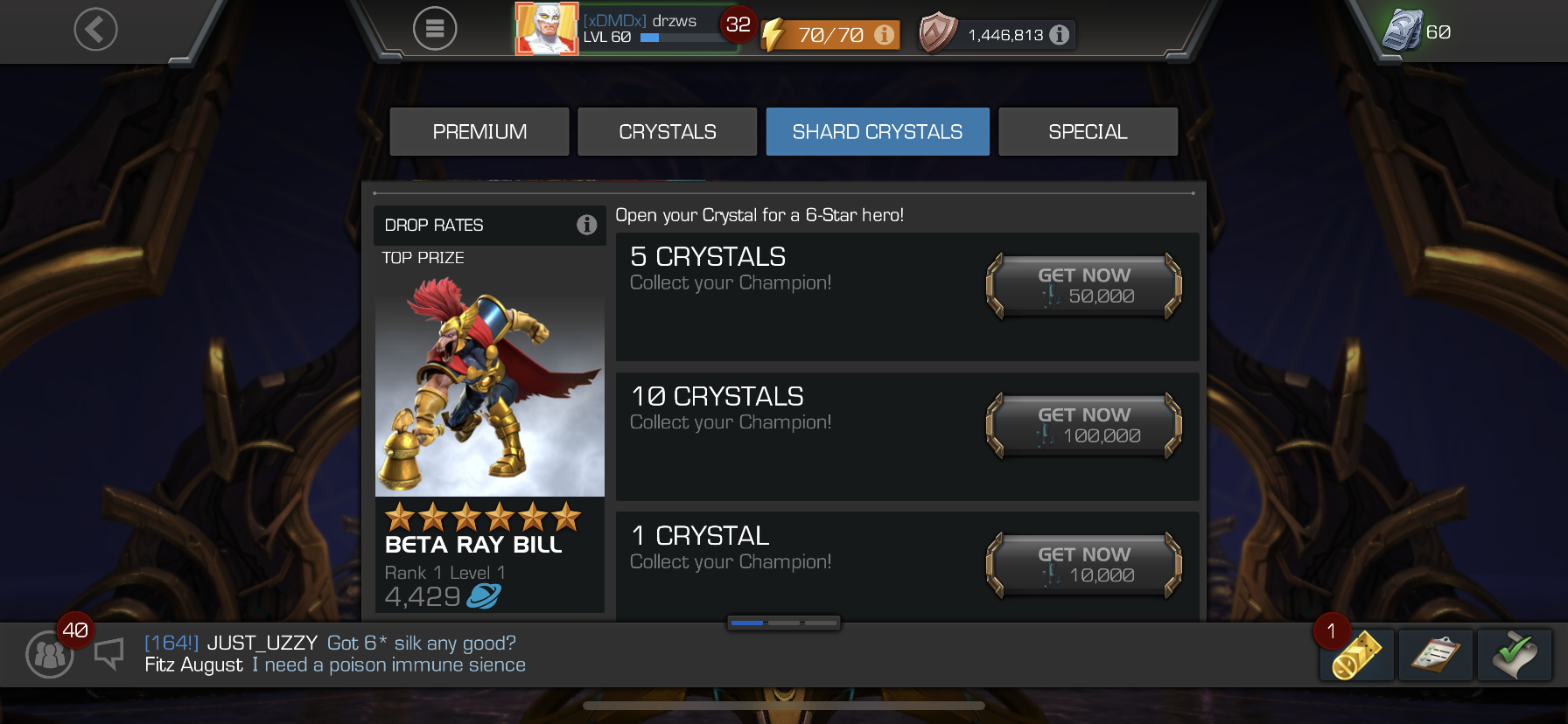
Not to mention this image here, just an eye soar, it’s super annoying.
Please sort it out, do something, I should be able to remember where a crystal is, but
it’s changing and is just unorganised.
I understand that this isn’t something Kabam are probably too overly concerned about, and most of you guys would prefer bug fixes, but please at least acknowledge the fact that crystal UI’s just don’t look good, and are confusing.
Rant over thanks for reading.

![Photo of [Deleted User]](https://us.v-cdn.net/6029252/uploads/defaultavatar/n1NX1KZ6AC8ZT.jpg)