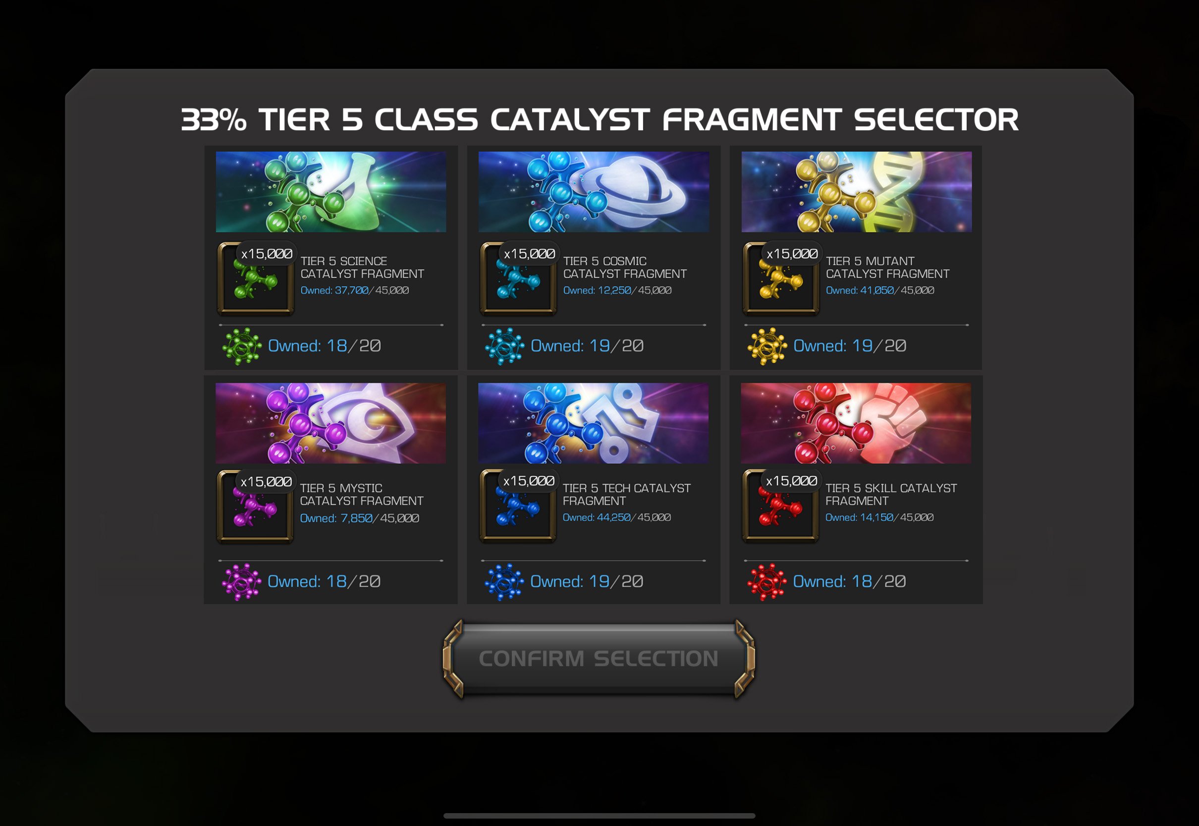
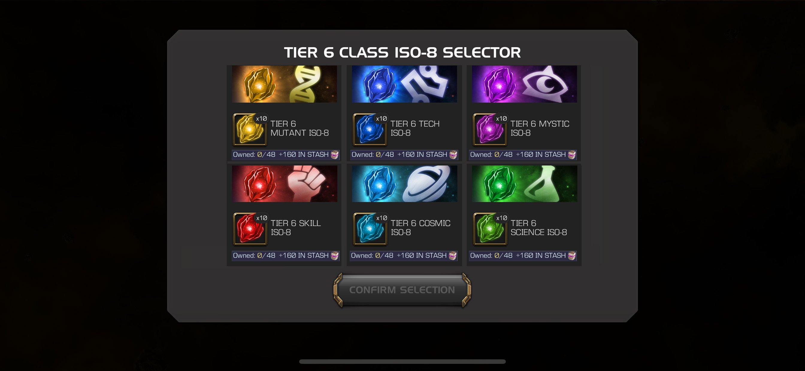
currently the selector options require scrolling to the right. i request a qol of improvement for selectors with 6 or less options (iso selectors, t5c, t6c, progression selectors) to have all the info be on one screen. would just make life a bit easier. examples I quickly photoshopped together (first pic is on ipad / large screen; second pic is on iphone / smaller screen):


obviously not a big deal in the grand scheme of things and Thor knows there are bigger issues to fix, but this would be just 1 small improvement.