Not a popular opinion, but I love them. Then again, I love purple. Lol. Not all of em are purple though. At least they weren't for me. What other color did you have? All 6 fights I had were purple.
Not a popular opinion, but I love them. Then again, I love purple. Lol. Not all of em are purple though. At least they weren't for me.
Not a popular opinion, but I love them. Then again, I love purple. Lol.
Not a popular opinion, but I love them. Then again, I love purple. Lol. Not all of em are purple though. At least they weren't for me. What other color did you have? All 6 fights I had were purple. I believe I had an orange. Maybe it was a bug or was my eyes playing tricks on me.
Looks kinda cheap and tacky for me. Purple is a nice choice but would have made it more of a dark royal purple than this. Hopefully they are open to the feedback!
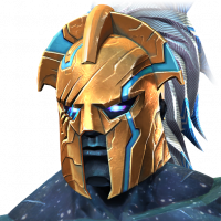
Sorry, it looks cheap and kiddish for the prominence of what "7 stars" should be. Green and Purple is a rough color scheme on it's own (it's branding goes along with joker or OG hulk) but the little crystal shard things in the corners feel too much like candy sprinkles. The bright saturation feels like candy crush merged with MCOC.The thing about the borders is you collect shards, form a crystal and then it pops/explodes open to reveal the champ. Having the crystal shards stuck to the frame feels like it's not finished in the lifecycle of a hero crystal... and that might be why it feels messy too to me.I never like to just criticize though without suggestions. Also I love the color purple. If it would help, I think if they went with "royal purple" or a blend of a purple with blue highlights, it would have felt more like a cosmic/galaxy look. Here's what I mean by that blend:
Looks like it's got plants growing out of the purple border, not a fan. Bur then it don't really make much of a difference to the champs