v35.1 QOL Updates: Coming June 6th

Greetings Summoners!

I’m writing once again to let you know about some upcoming QoL features coming into the 35.1 build which releases on June 6th. We’ve got some really cool ones coming in this one so let us not delay any further and jump into it.

Champion Rank Filter


We’ve added a filter to filter out champions by rank. Useful for building specific arena teams or if you want to sort out your next potential rank-ups.

Better Rank Up Gem Use Item Flow


We’ve improved the logic of the rank-up champions button found when clicking on a rank-up gem from the inventory. It will now show all available champions that can use the gem instead of just showing any champion that can be ranked up.

Sig Ability Sorting


Added a sig ability sort mechanism that will sort champs in the heroes screen by their sig levels. In addition to this, we’ve made the popup for using sig stones sort champs by their sig so when using the below popup it will be easier to top those champions closest to max sig.

Alliance War Attack Bonus Icon


(WIP SUBJECT TO CHANGE)
We’ve introduced a new icon to show the attack bonus achieved in each alliance war fight. It will show the number of attack bonuses remaining when the fight was taken down. This should hopefully give alliances better information on where they are struggling and also not require each alliance member to report deaths in order for leadership to properly track deaths.

Stash Count Visualization

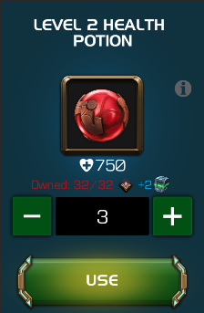
The stash is a very important aspect of resource management in the Contest but it’s sometimes hard to gather information from it without going back and forth through various menus. To help this we’ve added an icon and text to show how many items you have in the stash in various different locations of our UI. This way Summoners can know how much of an item is in their stash quicker and before they potentially need to use it. The icon additionally will turn red if some of the items in your stash are about to expire(See energy example below). We’ve added a bunch in this release but do plan to add more in other locations over time.


Buff Node Info Screen Overhaul


Reading nodes is important. Experienced summoners are keenly aware of how impactful nodes can be. For this reason, displaying nodes in the best light is key to helping summoners understand the challenges that await them. We’ve done some substantial changes to the buff node info screen in order to better equip the summoner in this endeavor.

We started out by widening the screen and moving the filter buttons out in order to make more space for each node and its description. This allows for more nodes to be seen at once and for the more verbose nodes to be readable without scrolling. We also made it so that all nodes are in one scroll so the user can just scroll down to see them all without having to tap the filter buttons. The filter buttons now work as a quick scroll to quickly scroll to the right area if needed.

In addition to the above, we made it possible to view the defender on this screen. This gives summoners the opportunity to see the abilities of the enemies they will be facing; before they actually face them. This is especially useful with the unique boss fights like the Maestro, Grandmaster, and Superior Kang as their abilities are not found anywhere else in-game.


That’s all for now. Thanks for taking the time to read all about these awesome new features coming your way around June 6th.

As a bit of a housekeeping note, I won’t actually be around when this forum post comes live as I will be on paternity leave. Don’t worry though as I will be sure to read all the comments when I get back and I look forward to seeing what you all think about these changes, so please let me know!
«13

Comments

  • GrassKnucklesGrassKnuckles Member Posts: 1,948 ★★★★★
    Wow, this is awesome!
  • TheParasiteTheParasite Member Posts: 408 ★★
    My regards always to you Kabam Zero :smile:
  • SeenkSeenk Member Posts: 214 ★★
    Love this game!
  • Cano29848Cano29848 Member Posts: 100
    Love the new addition also
  • StevieManWonderStevieManWonder Member Posts: 5,019 ★★★★★
    Killer, love the Stash Count Visualization!
  • Mik81Mik81 Member Posts: 102 ★★
    You should be called Kabam 10, because you are awesome!

    Congratulations for your paternity!
  • StuchStuch Member Posts: 45
    Can you guys let us see the nodes in the end of fight screen? I think that will be really for fights that you win but have interactions in
  • SkyLord7000SkyLord7000 Member Posts: 4,000 ★★★★★
    Congrats on the baby!! 🥳🎉👶
  • TyphoonTyphoon Member Posts: 1,856 ★★★★★


    Alliance War Attack Bonus Icon


    (WIP SUBJECT TO CHANGE)
    We’ve introduced a new icon to show the attack bonus achieved in each alliance war fight. It will show the number of attack bonuses remaining when the fight was taken down. This should hopefully give alliances better information on where they are struggling and also not require each alliance member to report deaths in order for leadership to properly track deaths.

  • Maverick75Maverick75 Member Posts: 746 ★★★
    Awesome QoL changes ! Thank you !
    I requested for the sig ability sorting, that’s fine.
    The complete view of the inventory and the stash for an item is a good idea.

    In the champions inventory, what about adding an icon or a new stars color to identify the max sig or adding the value of the sig?

    Several requests for a next batch of QoL changes:
    1) Help sorting or filtering (10-help request for energy are hidden among all the 5-help request for arena). Maybe add a sort by rarity to give a priority to 6*, then 5* and so on.
    2) In AQ, please move the player name in order to not be on the next step button. It is irritating to do focus to be able to tap on the move (instead of tapping our own profile).
    3) Because we do a lot of retry in SoP and EoP, this is too long to exit and then enter again in the quest. So reduce to 1 step and by the way reduce the number of load. Obviously, with only 1 champion, if you give up the fight of SoP/EoP and then loose your champion, that’s to restart the quest, not to revive the champion. No need to go back to the champion selection screen with the opponent or to the map.
    4) In the inventory, add filters or shortcuts to go find or go quickly to the types of objects (stones and gems, boosts... well the main ones). By the way, the current sort is not perfect (some types are dispatched).
    5) In the crystals, add filters or shortcuts to go quickly to some types (catalyst and shards crystals, arena crystals...). At least the main ones.
  • GroundedWisdomGroundedWisdom Member Posts: 36,575 ★★★★★
    Looking good! Congratulations on the new little one!
  • NoobdaNoobda Member Posts: 787 ★★★
    Zero is Hero!
  • RasiloverRasilover Member Posts: 1,478 ★★★★
    Great work as always!
  • SpideyFunkoSpideyFunko Member Posts: 21,948 ★★★★★
    These look great

    Congrats on the kiddo!
  • VendemiaireVendemiaire Member Posts: 2,178 ★★★★★
    Congrats, Zero! Btw, you're a godsend to the community.
  • EtherionGodEtherionGod Member Posts: 270 ★★
    Nice QOL changes! I can't wait!
  • This content has been removed.
  • Malreck04Malreck04 Member Posts: 3,324 ★★★★★
    Congratulations, and once again, amazing work
  • Colinwhitworth69Colinwhitworth69 Member Posts: 7,470 ★★★★★
    Very

    Very

    Very

    Cool.
  • Lord_ShaedowLord_Shaedow Member, Content Creators Posts: 13 Content Creator
    @Kabam Zero You are da man!

Sign In or Register to comment.