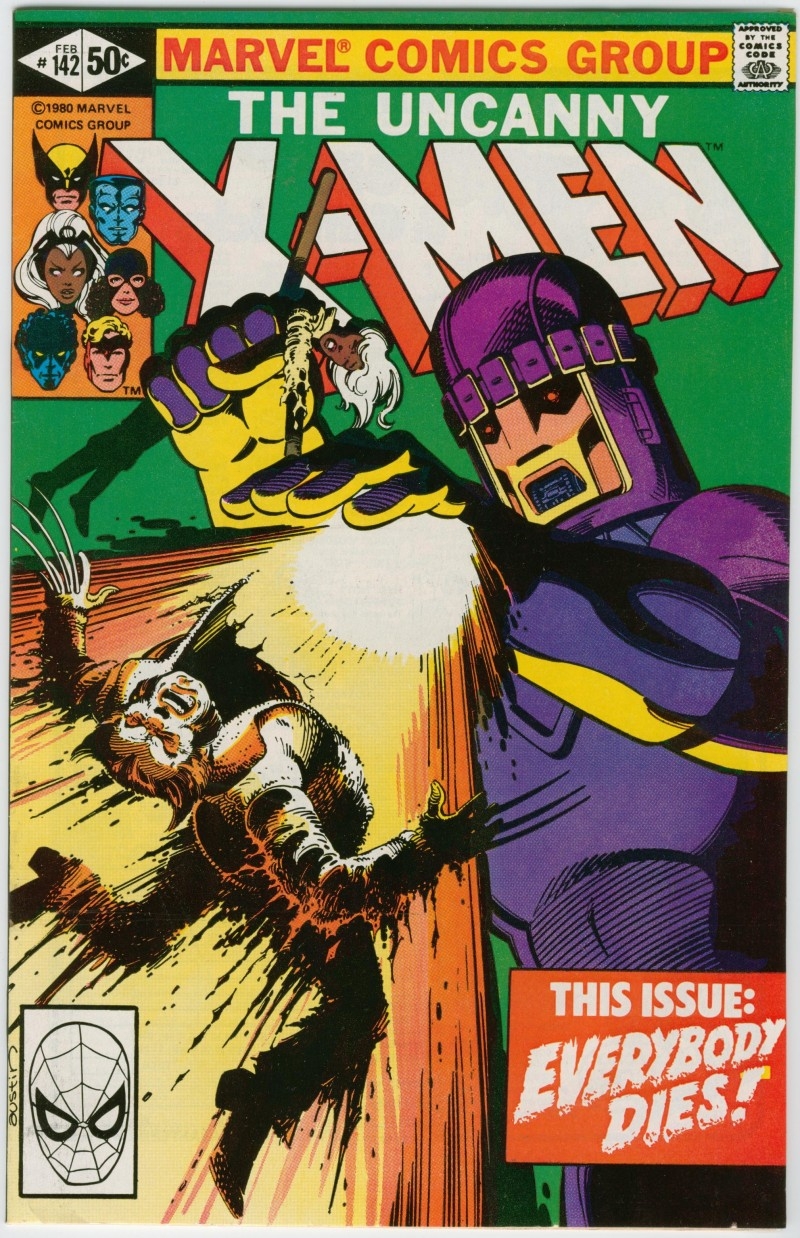
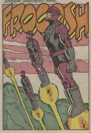
CapWW2 wrote: » Are barbies entering the contest? That color hurt my eyes. What a horrible idea of design. The thing looks like a giant hatchimal. Sentinels are purple and red wine metallic not pink and barbie colors.
rogueKlyntar wrote: » Whododo872 wrote: » Kabam Miike wrote: » NOTE: If you're a Summoner that reads the dialogue in these quests, you're gonna come across some interactions between Sentinel and other Champions that seems.... odd. It's a bug that we weren't able to fix in time. Just remember... it's a Robot, its speaker box could be anywhere, and we're all adults here. I hope you’re okay with the fact that I’ll be bashing you guys for any text errors anyways. Strictly for that good banter, of course I should also note that upon reading the initial post closely, I count at least two very noticeable text errors. One of those is even repeating a word twice in a row Besides the subject-verb disagreement between "interactions" and "seems", and the obvious mispelling of "Mike", what are you referring to? I am surprised that they got the "its-it's" distinction down though...
Whododo872 wrote: » Kabam Miike wrote: » NOTE: If you're a Summoner that reads the dialogue in these quests, you're gonna come across some interactions between Sentinel and other Champions that seems.... odd. It's a bug that we weren't able to fix in time. Just remember... it's a Robot, its speaker box could be anywhere, and we're all adults here. I hope you’re okay with the fact that I’ll be bashing you guys for any text errors anyways. Strictly for that good banter, of course I should also note that upon reading the initial post closely, I count at least two very noticeable text errors. One of those is even repeating a word twice in a row
Kabam Miike wrote: » NOTE: If you're a Summoner that reads the dialogue in these quests, you're gonna come across some interactions between Sentinel and other Champions that seems.... odd. It's a bug that we weren't able to fix in time. Just remember... it's a Robot, its speaker box could be anywhere, and we're all adults here.
Liss_Bliss_ wrote: » CapWW2 wrote: » Are barbies entering the contest? That color hurt my eyes. What a horrible idea of design. The thing looks like a giant hatchimal. Sentinels are purple and red wine metallic not pink and barbie colors. Actually that’s mot true @CapWW2 maybe in the movies, but many of us view Sentinels as they looked in the 90’s and this model is pretty much perfectly spot on.
CapWW2 wrote: » With all due respect please do research before speaking without base or knowledge. I actually read marvel and collect comics. I have watched virtually all marvel sagas and x-men is my favorite so I do know what I am talking about.
Aditya_vaibhav1998 wrote: » What is the requirements for playing uncollected difficulty mode?
Alpha07 wrote: » Am i the only one who found the Sentinel harder than the Last Sabretooth?
CapWW2 wrote: » The original color is not purple pink like. Someone had a brain fart after in edition 142.
Spurgeo14 wrote: » Alpha07 wrote: » Am i the only one who found the Sentinel harder than the Last Sabretooth? Sabretooth was still harder in my opinion, but Sentinel is annoying because power burn doesn't work right against him. I used Magik and he still got to SP3.